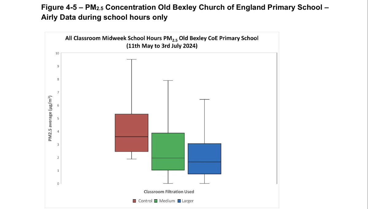
I saw this chart while reviewing lab reports. The experiment was conducted in a school classroom: a control group (no air purifier), a medium group (with a medium-sized air purifier), and a large group (with a large air purifier), and then the results were compared. It's clear that the larger device is more effective. However, looking at the vertical axis, even the PM2.5 in the control group was only 5µg/m3, which is almost perfect. In other words, they're doing something that scores 99 to 100...
Loading thread detail
Fetching the original tweets from X for a clean reading view.
Hang tight—this usually only takes a few seconds.
